Android Push Templates
Learn how to implement and customize Push Notification for your Android device.
Overview
The CleverTap Push Templates SDK enhances user engagement through rich, customizable push notification templates that work seamlessly with CleverTap Android SDK v7.4.1 and above.
Prerequisites
To use the CleverTap Push Templates SDK, you must integrate the CleverTap Android SDK version v7.4.1 or above.
Installation
The Android Push Templates SDK supports the following two integration options:
- Out-of-the-box Implementation : Uses CleverTap's default notification handling, where templates are rendered without additional customization or code changes in your app.
- Custom Implementation: Allows you to control how push notifications are received and displayed.
Configure Out-of-the-Box Push Notification Handling
To configure out-of-the-box Push Notification Handling, perform the following steps:
- Add the dependencies to the
buildas given in the following code:
implementation "com.clevertap.android:push-templates:2.2.0" // 2.1.0 and above
implementation "com.clevertap.android:clevertap-android-sdk:7.8.0" // 7.4.1 and above- Add the following line of code to your Application class:
CleverTapAPI.setNotificationHandler((NotificationHandler)new PushTemplateNotificationHandler());CleverTapAPI.setNotificationHandler(PushTemplateNotificationHandler() as NotificationHandler);Customize Push Notification Handling
To customize the Push Notification handling, add the following code in your custom FirebaseMessageService class:
public class PushTemplateMessagingService extends FirebaseMessagingService {
    @Override
    public void onMessageReceived(RemoteMessage remoteMessage) {
        CTFcmMessageHandler()
                .createNotification(getApplicationContext(), remoteMessage);
    }
}
class MyFcmMessageListenerService : FirebaseMessagingService() {
override fun onMessageReceived(message: RemoteMessage) {
super.onMessageReceived(message)
CTFcmMessageHandler()
.createNotification(applicationContext, message)
}
}Supported Push Templates
You can implement the following customizable push notification templates using the CleverTap Android Push Template Library SDK. The templates can be broadly classified as follows:
Basic Templates
Carousel Templates
Advanced Templates
- Timer Template
- Text over Image Template
- Five Icons Template
- Rating Template
- Product Catalog Template
- Input Box Template
- Vertical Image CTA
Standard Push Template
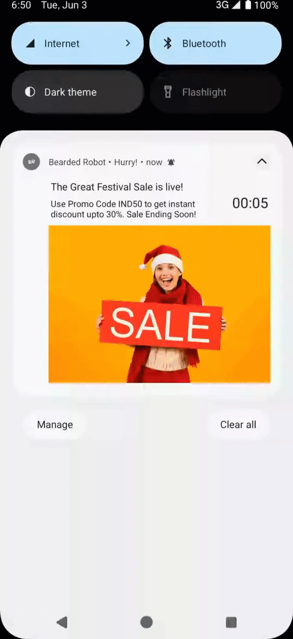
Standard Template is a default template for push notifications received on apps that supports a simple layout with title, message, image, and optional buttons, ideal for quick, informative alerts. For example, an e-commerce business might want to inform customers that their order is on the way. To use a GIF in a standard push template, pass the key wzrk_gif with the value set to the URL of the GIF image.
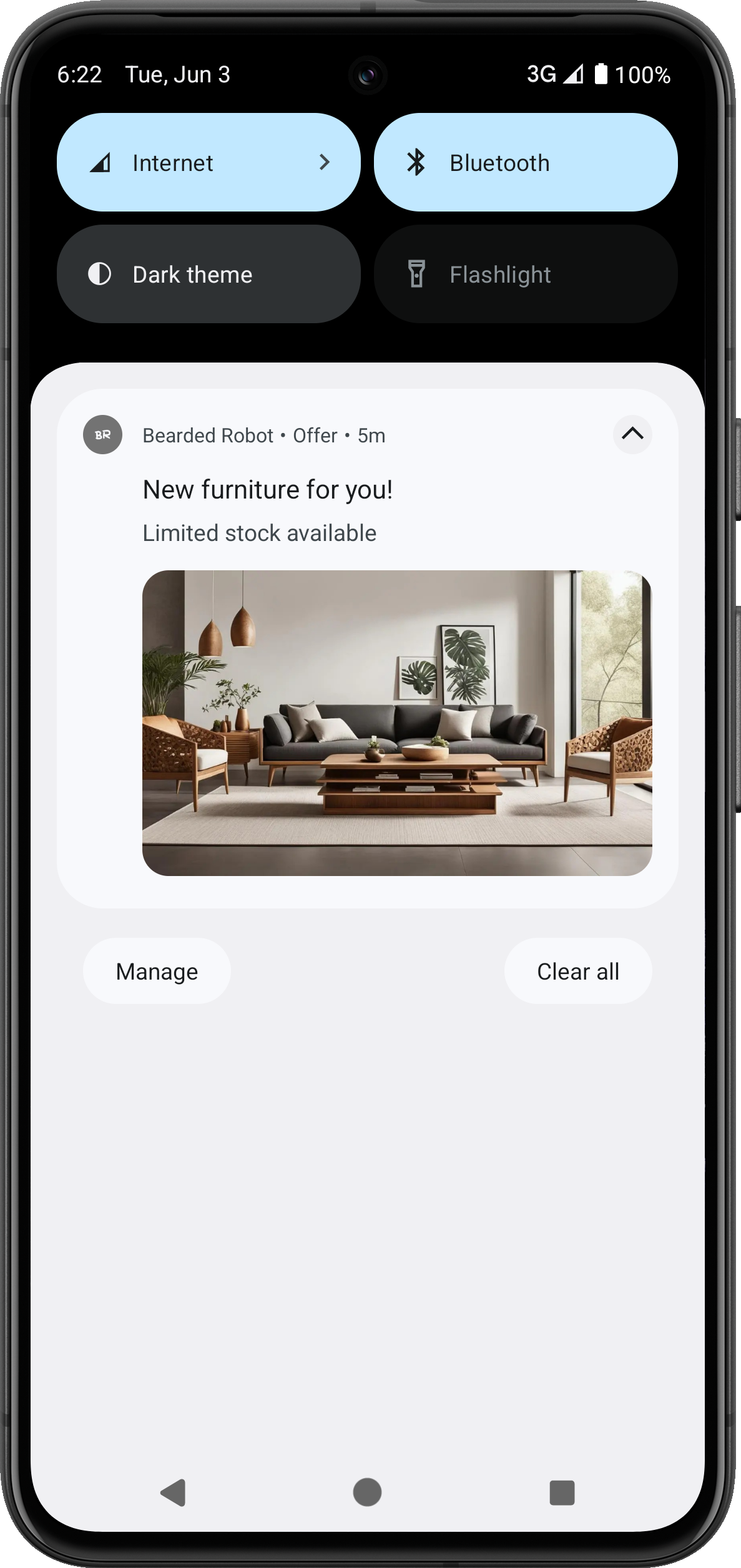
Standard Push Template
Advanced Push Template
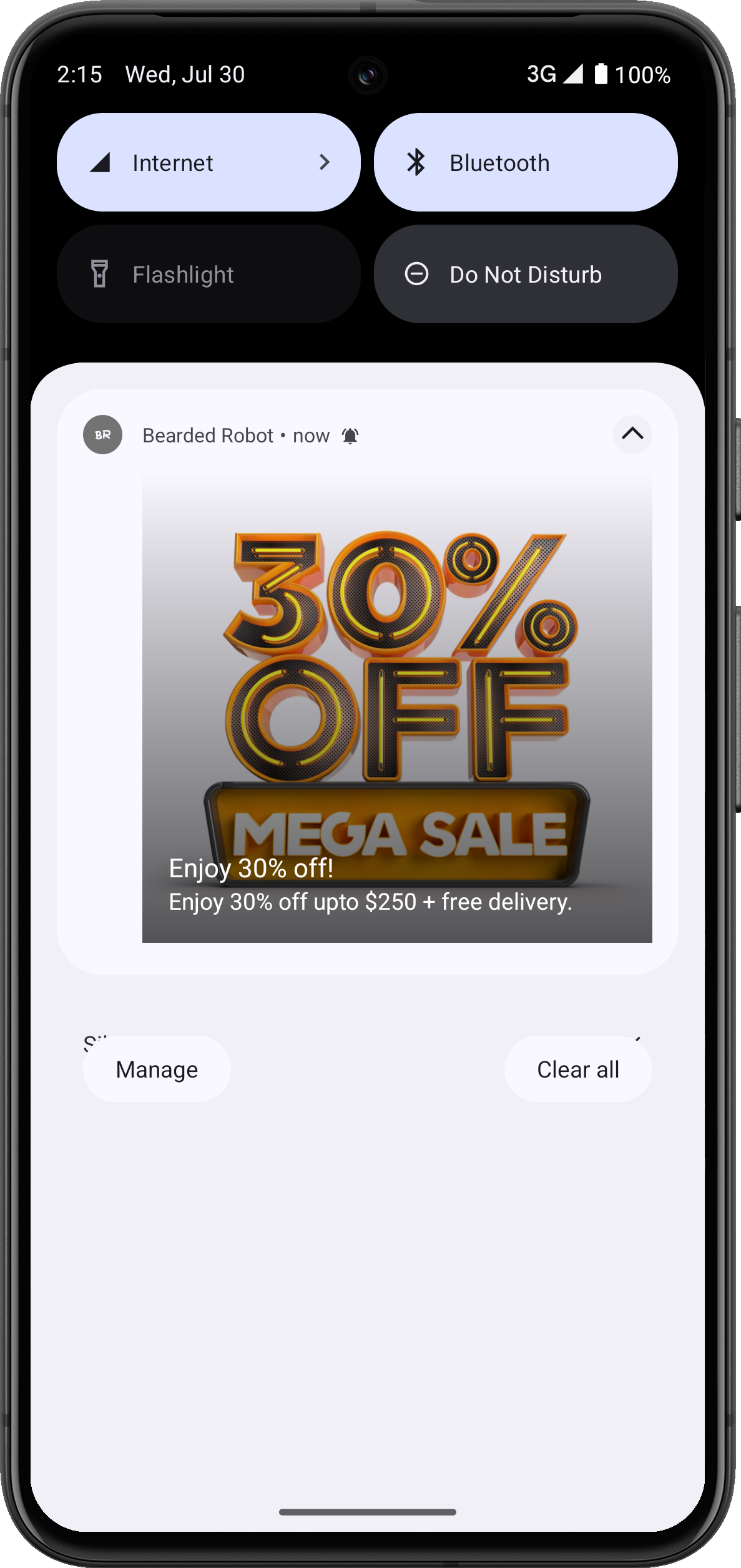
This template supports rich media, deep links, and enhanced customization for more engaging messages. It is ideal for interactive, visually appealing messages. For example, businesses can use it to build excitement for new product drops, early access offers, or feature rollouts that benefit from strong visuals and clear Call to Action (CTAs).
For template outputs Android 11 and below, refer to Push Templates on Android v11 and below.
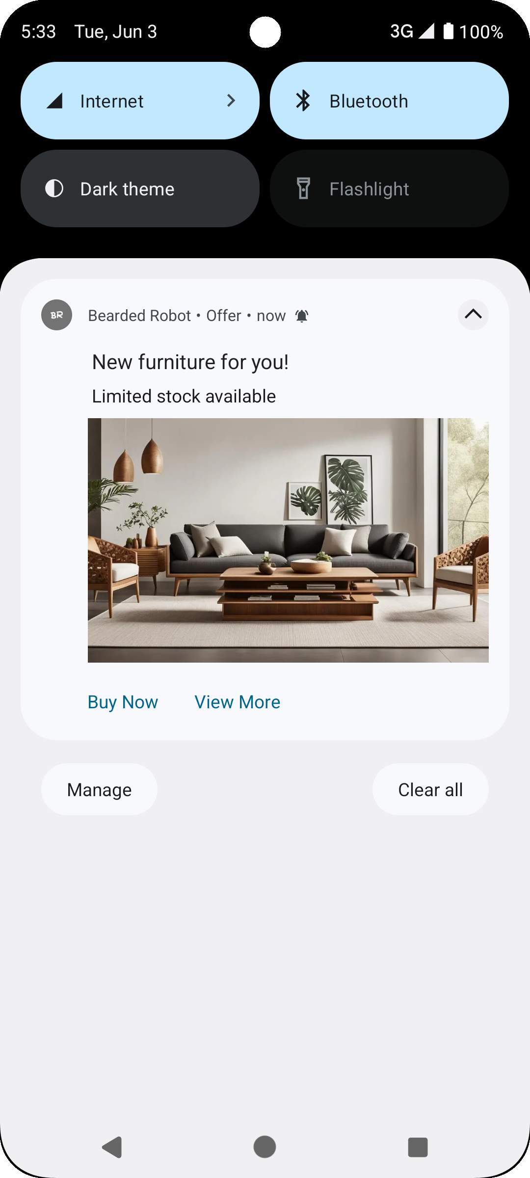
Advanced Push Template
Template Keys
Advanced Template Keys | Required | Description |
|---|---|---|
pt_id | Required | Indicates the type of template, for example, |
pt_title | Required | Maps to the campaign title, the main headline of your notification must be concise and attention-grabbing, defining the exact purpose of your campaign. |
pt_msg | Required | Maps to the campaign message, the body text of your notification. The message should clearly convey the purpose of your campaign. |
pt_msg_summary | Required | Message line when Notification is expanded. |
pt_subtitle | Optional | Subtitle |
pt_bg | Required | Background color of your push notification. You can use it to match your brand theme or draw visual attention to the notification. It accepts HEX codes or color pickers. |
pt_bg_dark | Optional | Background color of your push notification in dark mode |
pt_big_img | Optional | Image |
pt_big_img_alt_text | Optional | Alt Text for Image |
pt_gif | Optional | GIF |
pt_gif_frames | Optional | Number of frames to extract from the GIF |
pt_ico | Optional | Large Icon |
wzrk_hide_large_icon | Optional | Hide the large icon in Android notifications true to hide the icon false to show the icon (Default) |
pt_dl1 | Optional | One Deep Link (minimum) |
pt_title_clr | Optional | Title Color in HEX |
pt_title_clr_dark | Optional | Title Color in HEX in dark mode |
pt_msg_clr | Optional | Message Color in HEX |
pt_msg_clr_dark | Optional | Message Color in HEX in dark mode |
pt_small_icon_clr | Optional | Small Icon Color in HEX |
pt_small_icon_clr_dark | Optional | Small Icon Color in HEX in dark mode |
pt_scale_type | Optional | Specify the image scaling type for notifications. Available values: fit_center center_cropFor more information on how it works, refer to Image Scaling. |
pt_sticky | Optional | Should the notification be sticky? ("true"/"false") |
pt_dismiss | Optional | Auto dismiss the notification after a set time (value in seconds) |
pt_json | Optional | Above template keys in JSON format |
Auto Carousel Template
Auto Carousel is an automatic revolving carousel push notification that automatically cycles through multiple cards or slides within a single notification. Each card typically includes an image, title, description, and a CTA button, allowing users to view multiple offers, messages, or product highlights without leaving their device’s notification tray.
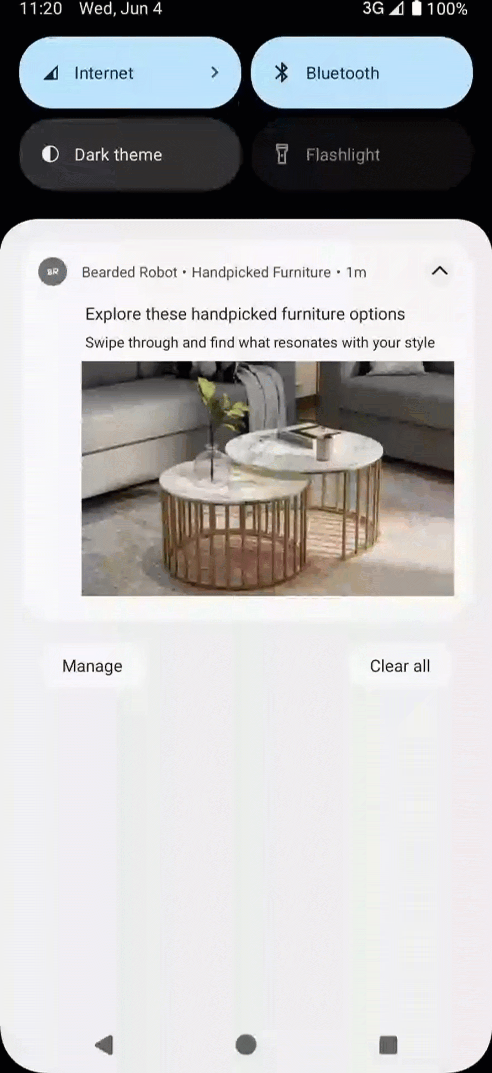
Auto Carousel Template
Template Keys
Auto Carousel Template Keys | Required | Description |
|---|---|---|
pt_id | Required | Indicates the type of template, for example, |
pt_title | Required | Maps to the campaign title, the main headline of your notification must be concise and attention-grabbing, defining the exact purpose of your campaign. |
pt_msg | Required | Maps to the campaign message, the body text of your notification. The message should clearly convey the purpose of your campaign. |
pt_msg_summary | Optional | Message line when Notification is expanded. |
pt_subtitle | Optional | Subtitle |
pt_dl1 | Required | Deep Link (Max one) |
pt_img1 | Required | Image One |
pt_img1_alt_text | Optional | Alt Text for Image One |
pt_img2 | Required | Image Two |
pt_img2_alt_text | Optional | Alt Text for Image Two |
pt_img3 | Required | Image Three |
pt_img3_alt_text | Optional | Alt Text for Image Three |
pt_img | Optional | Image |
pt img | Optional | Alt Text for Image |
pt_bg | Required | Background Color in HEX |
pt_bg_dark | Required | Background Color in HEX in dark mode |
pt_ico | Optional | Large Icon |
wzrk_hide_large_icon | Optional | Hide the large icon in Android notifications true to hide the icon false to show the icon (Default) |
pt_title_clr | Optional | Title Color in HEX |
pt_title_clr_dark | Optional | Title Color in HEX in dark mode. |
pt_msg_clr | Optional | Message Color in HEX |
pt_msg_clr_dark | Optional | Message Color in HEX in dark mode |
pt_small_icon_clr | Optional | Small Icon Color in HEX |
pt_small_icon_clr_dark | Optional | Small Icon Color in HEX in dark mode |
pt_sticky | Optional | Should the notification be sticky? ("true"/"false") |
pt_dismiss | Optional | Auto dismiss the notification after a set time (value in seconds) |
pt_scale_type | Optional | Specify the image scaling type for notifications. Available values: fit_center center_cropFor more information on how it works, refer to Image Scaling. |
pt_json | Optional | Above keys in JSON format |
Manual Carousel Template
Manual Carousel is an interactive push notification format that allows users to browse through multiple cards or slides at their own pace. Each card typically features rich content such as images, titles, short descriptions, and a CTA. Navigation is user-controlled, with arrows or swipe gestures enabling the transition between cards.
If only a single image is available for download, this template falls back to the Basic Template.
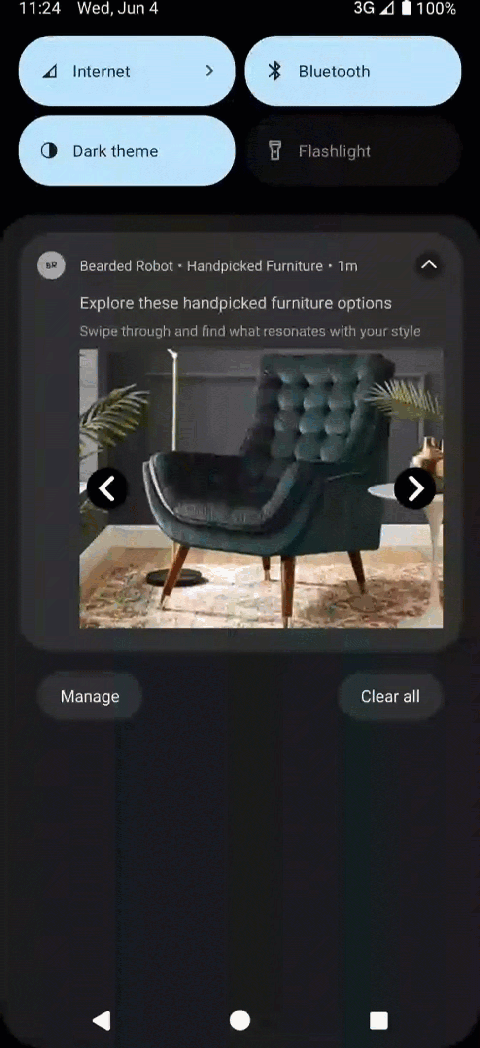
Manual Carousel Template
Template Keys
Manual Carousel Template Keys | Required | Description |
|---|---|---|
pt_id | Required | Indicates the type of template, for example, |
pt_title | Required | Maps to the campaign title, the main headline of your notification must be concise and attention-grabbing, defining the exact purpose of your campaign. |
pt_msg | Required | Maps to the campaign message, the body text of your notification. The message should clearly convey the purpose of your campaign. |
pt_msg_summary | Optional | Message line when Notification is expanded |
pt_subtitle | Optional | Subtitle |
pt_dl1 | Required | Deep Link One |
pt_dl2 | Optional | Deep Link Two |
pt_dl | Optional | Deep Link for the nth image |
pt_img1 | Required | Image One |
pt_img1_alt_text | Optional | Alt Text for Image One |
pt_img2 | Required | Image Two |
pt_img2_alt_text | Optional | Alt Text for Image Two |
pt_img3 | Required | Image Three |
pt_img3_alt_text | Optional | Alt Text for Image Three |
pt_img | Optional | Image |
pt img | Optional | Alt Text for Image |
pt_bg | Required | Background Color in HEX |
pt_bg_dark | Required | Background Color in HEX in dark mode |
pt_ico | Optional | Large Icon |
wzrk_hide_large_icon | Optional | Hide the large icon in Android notifications true to hide the icon false to show the icon (Default) |
pt_title_clr | Optional | Title Color in HEX |
pt_title_clr_dark | Optional | Title Color in HEX in dark mode |
pt_msg_clr | Optional | Message Color in HEX |
pt_msg_clr_dark | Optional | Message Color in HEX in dark mode |
pt_small_icon_clr | Optional | Small Icon Color in HEX |
pt_small_icon_clr_dark | Optional | Small Icon Color in HEX in dark mode |
pt_sticky | Optional | Should the notification be sticky? ("true"/"false") |
pt_dismiss | Optional | Auto dismiss the notification after a set time (value in seconds) |
pt_scale_type | Optional | Specify the image scaling type for notifications. Available values: fit_center center_cropFor more information on how it works, refer to Image Scaling. |
pt_json | Optional | Above keys in JSON format |
pt_manual_carousel_type | Optional |
|
pt_gif_frames | Optional | Number of frames to extract from the GIF |
Five Icons Template
The Five Icons template is a sticky push notification with no text, just five icons, and a close button that can help your users go directly to the functionality of their choice with a button click.
The library does not notify if at least three icons are not retrieved. The bifurcation of each CTA is captured in the event Notification Clicked within the property wzrk_c2a.
By default, if the user clicks on any notification area except the five and close icons, an activity intent launches.
Template Keys
| Five Icons Template Keys | Required | Description |
|---|---|---|
| pt_id | Required | Indicates the type of template, for example,pt_five_icons |
| pt_img1 | Required | Icon One |
| pt_img1_alt_text | Optional | Alt Text for Icon One |
| pt_img2 | Required | Icon Two |
| pt_img2_alt_text | Optional | Alt Text for Icon Two |
| pt_img3 | Required | Icon Three |
| pt_img3_alt_text | Optional | Alt Text for Icon Three |
| pt_img4 | Optional | Icon Four |
| pt_img4_alt_text | Optional | Alt Text for Icon Four |
| pt_img5 | Optional | Icon Five |
| pt_img5_alt_text | Optional | Alt Text for Icon Five |
| pt_dl1 | Required | Deep Link for first icon |
| pt_dl2 | Required | Deep Link for second icon |
| pt_dl3 | Required | Deep Link for third icon |
| pt_dl4 | Optional | Deep Link for fourth icon |
| pt_dl5 | Optional | Deep Link for fifth icon |
| pt_bg | Required | Background Color in HEX |
| pt_small_icon_clr | Optional | Small Icon Color in HEX |
| pt_small_icon_clr_dark | Optional | Small Icon Color in HEX in dark mode |
| pt_sticky | Optional | Should the notification be sticky? ("true"/"false") |
| pt_dismiss | Optional | Auto dismiss the notification after a set time (value in seconds) |
| pt_json | Optional | Above keys in JSON format |
Timer Template
Timer template is a dynamic and time-sensitive push notification template designed to display a live countdown timer directly within the notification. This format is ideal for creating urgency around limited-time offers, flash sales, upcoming events, or deadlines. You can update the new message, title, or background image automatically once the countdown expires, keeping the notification relevant and engaging after expiry.
Timer notification is only supported for Android version 8 and above. For Android versions below 8, the library falls back to the Basic Template.
Timer Template
Template Keys
| Timer Template Keys | Required | Description |
|---|---|---|
| pt_id | Required | Indicates the type of template, for example, pt_timer |
| pt_title | Required | Maps to the campaign title, the main headline of your notification must be concise and attention-grabbing, defining the exact purpose of your campaign. |
| pt_title_alt | Optional | Title to show after timer expires |
| pt_msg | Required | Maps to the campaign message, the body text of your notification. The message should clearly convey the purpose of your campaign. |
| pt_msg_alt | Optional | Message to show after timer expires |
| pt_msg_summary | Optional | Message line when Notification is expanded |
| pt_subtitle | Optional | Subtitle |
| pt_dl1 | Required | Deep Link |
| pt_big_img | Optional | Image |
| pt_big_img_alt | Optional | Image to show when timer expires |
| pt_big_img_alt_text | Optional | Alt Text for Image |
| pt_big_img_alt_alt_text | Optional | Alt Text for Image to show when timer expires |
| pt_gif | Optional | GIF |
| pt_gif_frames | Optional | Number of frames to extract from the GIF |
| pt_bg | Required | Background Color in HEX |
| pt_bg_dark | Required | Background Color in HEX in dark mode |
| pt_chrono_title_clr | Optional | Color for timer text in HEX |
| pt_chrono_title_clr_dark | Optional | Color for timer text in HEX in dark mode |
| pt_timer_threshold | Required | Timer duration in seconds (minimum 10) |
| pt_timer_end | Optional | Epoch Timestamp to countdown to (for example, $D_1595871380 or 1595871380). Not required if pt_timer_threshold is specified. |
| pt_title_clr | Optional | Title Color in HEX |
| pt_title_clr_dark | Optional | Title Color in HEX in dark mode |
| pt_msg_clr | Optional | Message Color in HEX |
| pt_msg_clr_dark | Optional | Message Color in HEX in dark mode |
| pt_small_icon_clr | Optional | Small Icon Color in HEX |
| pt_small_icon_clr_dark | Optional | Small Icon Color in HEX in dark mode |
| pt_scale_type | Optional | Specify the image scaling type for notifications. Available values: fit_center center_cropFor more information on how it works, refer to Image Scaling. |
| pt_render_terminal | Optional | Determines whether terminal notification is rendered Value- true or false |
| pt_sticky | Optional | Should the notification be sticky? ("true"/"false") |
| pt_dismiss | Optional | Auto dismiss the notification after a set time (value in seconds) |
| pt_msg_summary_alt | Optional | Summary to display once the timer expires |
| pt_json | Optional | Above keys in JSON format |
| pt_chrono_style | Optional | Controls styling mode. Available values: solid (default), gradient_linear , gradient_radial |
| pt_chrono_bg_clr | Optional | Background color (HEX). Required if style = solid |
| pt_chrono_border_clr | Optional | Border color (HEX). No border if absent |
| pt_chrono_grad_clr1 | Optional | Gradient start color (HEX) |
| pt_chrono_grad_clr2 | Optional | Gradient end color (HEX) |
| pt_chrono_grad_dir | Optional | Angle in degrees (String). Default "90" |
| pt_chrono_border_radius | Optional | Corner radius in dp (Density-independent Pixels) (Default: 6) |
| pt_chrono_border_width | Optional | Border width in dp. No border if absent, even if pt_chrono_border_clr is set. |
| pt_chrono_title_clr | Optional | Countdown text color (falls back to pt_title_clr) |
NoteWhen a notification arrives with an already-expired timer (or remaining time below 10 seconds), and if
pt_render_terminalis true, the SDK renders the terminal/fallback notification as a Basic template (usingpt_title_alt,pt_msg_alt,pt_big_img_alt). Ifpt_render_terminalis false, the notification is silently skipped.
Text over Image Template
Text over Image template is a visually immersive push notification format designed to maximize the use of imagery. In this layout, the background image spans the entire surface area of the notification, creating an edge-to-edge visual experience. All accompanying text such as the title, message, and call-to-action is seamlessly overlaid on top of the image, ensuring the message is prominent while maintaining a clean, modern aesthetic.
The library falls back to the Advanced Template if the image cannot be downloaded.
Text over Image Push Template
Template Keys
Text over Image Template Keys | Required | Description |
|---|---|---|
pt_id | Required | Indicates the type of template, for example, |
pt_title | Required | Maps to the campaign title, the main headline of your notification must be concise and attention-grabbing, defining the exact purpose of your campaign. |
pt_msg | Required | Maps to the campaign message, the body text of your notification. The message should clearly convey the purpose of your campaign. |
pt_msg_summary | Optional | Message line when Notification is expanded. |
pt_subtitle | Optional | Subtitle |
pt_big_img | Required | Image |
pt_big_img_alt_text | Optional | Alt Text for Image |
pt_gif | Optional | GIF |
pt_gif_frames | Optional | Number of frames to extract from the GIF |
pt_small_view | Optional | Select text-only small view layout ( |
pt_dl1 | Optional | Deep Link |
pt_title_clr | Optional | Title Color in HEX |
pt_title_clr_dark | Optional | Title Color in HEX in dark mode |
pt_msg_clr | Optional | Message Color in HEX |
pt_msg_clr_dark | Optional | Message Color in HEX in dark mode |
pt_small_icon_clr | Optional | Small Icon Color in HEX |
pt_small_icon_clr_dark | Optional | Small Icon Color in HEX |
pt_scale_type | Optional | Specify the image scaling type for notifications. Available values: fit_center center_cropFor more information on how it works, refer to Image Scaling. |
pt_big_img_collapsed | Optional | Image for the collapsed view |
pt_gif_collapsed | Optional | GIF for the collapsed view |
pt_gif_frames_collapsed | Optional | Number of frames to extract from the GIF for the collapsed view |
pt_big_img_collapsed_alt_text | Optional | Alt Text for Image in the collapsed view |
pt_scale_type_collapsed | Optional | ScaleType for the image in the collapsed View ("center_crop"/"fit_center") |
pt_sticky | Optional | Should the notification be sticky? ("true"/"false") |
pt_dismiss | Optional | Auto dismiss the notification after a set time (value in seconds) |
pt_ico | Optional | Large Icon |
wzrk_hide_large_icon | Optional | Hide the large icon in Android notifications true to hide the icon false to show the icon (Default) |
pt_json | Optional | Above keys in JSON format |
Rating Template
Rating template lets your users give you feedback. This feedback is captured in the event Rating Submitted within the property wzrk_c2a.
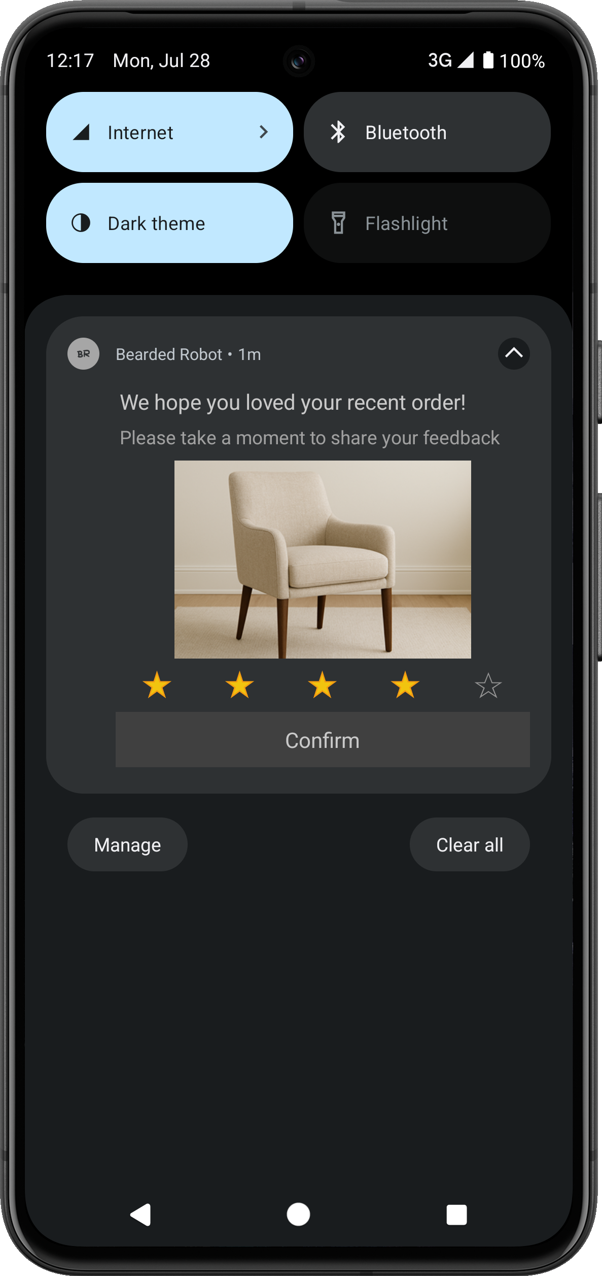
Rating Template
Template Keys
Rating Template Keys | Required | Description |
|---|---|---|
pt_id | Required | Value - |
pt_title | Required | Title |
pt_msg | Required | Message |
pt_default_dl | Required | Default Deep Link for Push Notification |
pt_dl1 | Required | Deep Link for first/all star(s) |
pt_bg | Required | Background Color in HEX |
pt_bg_dark | Required | Background Color in HEX in dark mode |
pt_msg_summary | Optional | Message line when Notification is expanded |
pt_subtitle | Optional | Subtitle |
pt_dl2 | Optional | Deep Link for second star |
pt_dl3 | Optional | Deep Link for third star |
pt_dl4 | Optional | Deep Link for fourth star |
pt_dl5 | Optional | Deep Link for fifth star |
pt_ico | Optional | Large Icon |
wzrk_hide_large_icon | Optional | Hide the large icon in Android notifications true to hide the icon false to show the icon (Default) |
pt_title_clr | Optional | Title Color in HEX |
pt_title_clr_dark | Optional | Title Color in HEX in dark mode. |
pt_msg_clr | Optional | Message Color in HEX |
pt_msg_clr_dark | Optional | Message Color in HEX in dark mode |
pt_small_icon_clr | Optional | Small Icon Color in HEX |
pt_small_icon_clr_dark | Optional | Small Icon Color in HEX in dark mode |
pt_scale_type | Optional | Specify the image scaling type for notifications. Available values: fit_center center_cropFor more information on how it works, refer to Image Scaling. |
pt_json | Optional | Above keys in JSON format |
pt_big_img | Optional | Image |
pt_big_img_alt_text | Optional | Alt Text for Image |
pt_gif | Optional | GIF |
pt_gif_frames | Optional | Number of frames to extract from the GIF |
pt_sticky | Optional | Should the notification be sticky? ("true"/"false") |
pt_dismiss | Optional | Auto dismiss the notification after a set time (value in seconds) |
Product Catalog Template
The product catalog template lets you showcase different product images (or a product catalog) before the user can click on the BUY NOW option, which can take them directly to the product via deep links. This template has two variants.
Vertical View
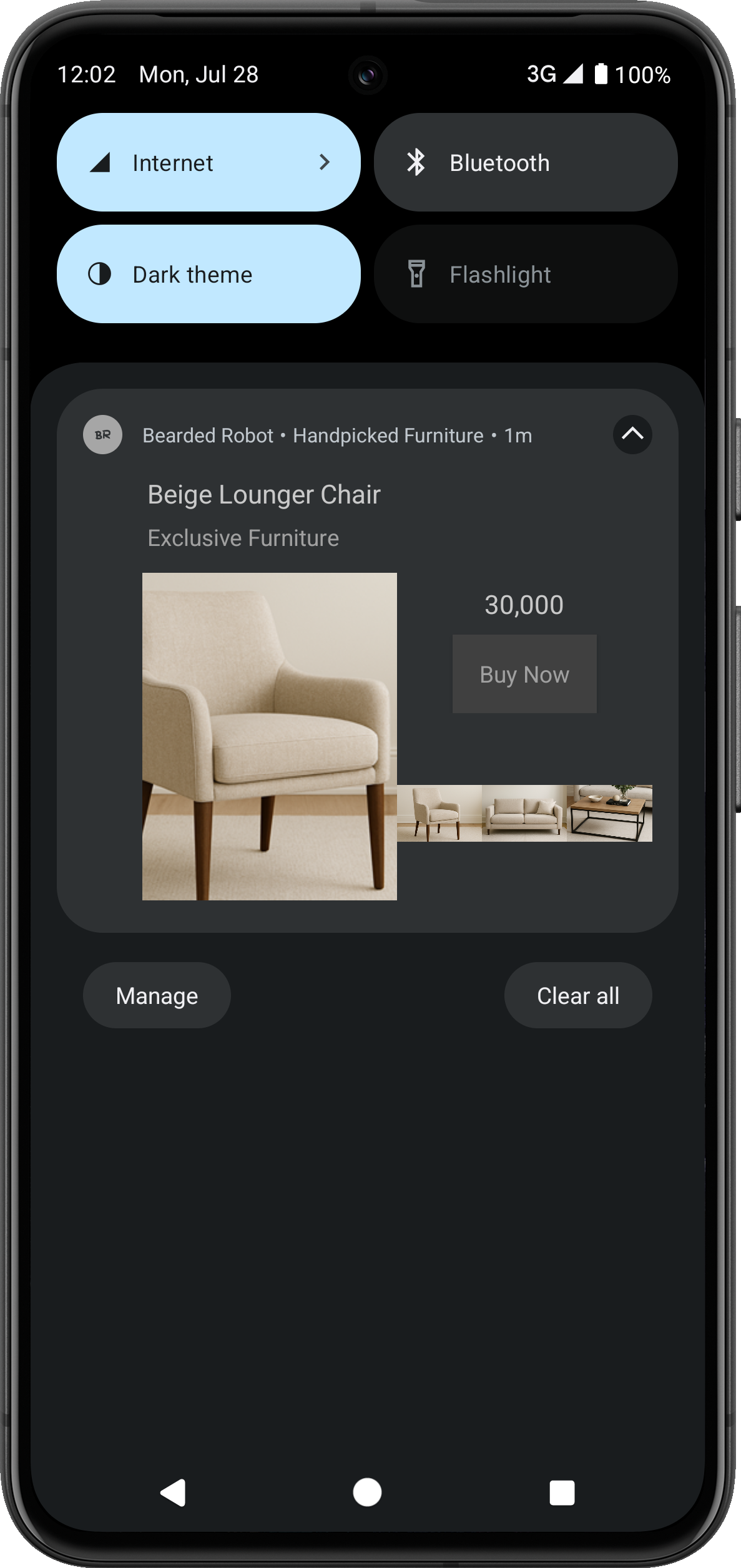
Product Catalog Template- Vertical View
Linear View
Use the following keys to enable the linear view variant of this template:
| Template Key | Required | Value |
|---|---|---|
| pt_product_display_linear | Optional | true |
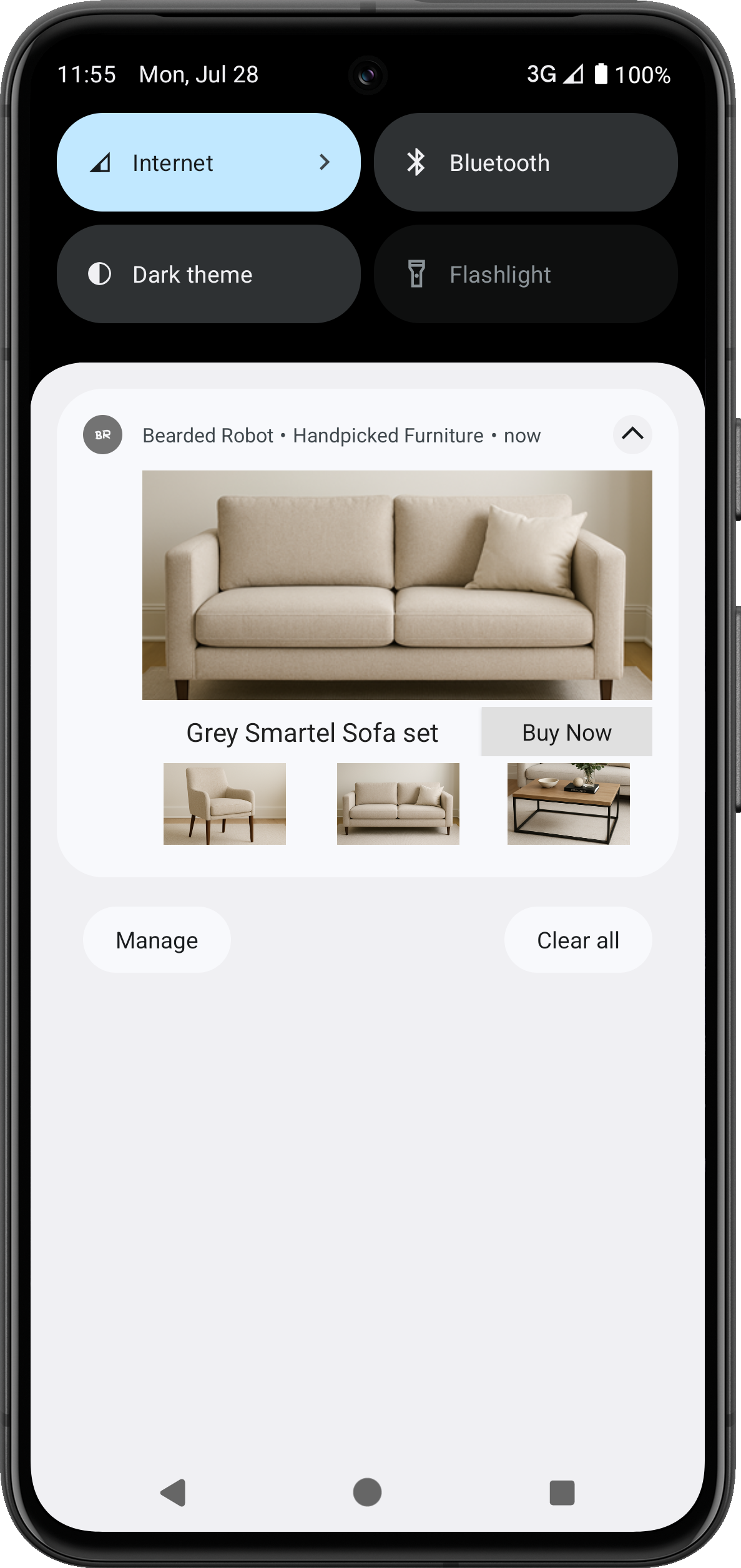
Product Catalog Template-Linear View
Template Keys
| Product Catalog Template Keys | Required | Description |
|---|---|---|
| pt_id | Required | Value - pt_product_display |
| pt_msg | Required | Message |
| pt_title | Required | Title |
| pt_img1 | Required | Image One |
| pt_img1_alt_text | Optional | Alt Text for Image One |
| pt_img2 | Required | Image Two |
| pt_img2_alt_text | Optional | Alt Text for Image Two |
| pt_img3 | Required | Image Three |
| pt_img3_alt_text | Optional | Alt Text for Image Three |
| pt_bt1 | Required | Big text for first image |
| pt_bt2 | Required | Big text for second image |
| pt_bt3 | Required | Big text for third image |
| pt_st2 | Required | Small text for second image |
| pt_st1 | Required | Small text for first image |
| pt_st3 | Required | Small text for third image |
| pt_dl1 | Required | Deep Link for first image |
| pt_dl2 | Required | Deep Link for second image |
| pt_dl3 | Required | Deep Link for third image |
| pt_price1 | Required | Price for first image |
| pt_price2 | Required | Price for second image |
| pt_price3 | Required | Price for third image |
| pt_bg | Required | Background Color in HEX |
| pt_bg_dark | Required | Background Color in HEX in dark mode |
| pt_product_display_action | Required | Action Button Label Text |
| pt_product_display_action_clr | Required | Action Button Background Color in HEX |
| pt_subtitle | Optional | Subtitle |
| pt_product_display_linear | Optional | Linear Layout Template ("true"/"false") |
| pt_title_clr | Optional | Title Color in HEX |
| pt_title_clr_dark | Optional | Title Color in HEX in dark mode. |
| pt_msg_clr | Optional | Message Color in HEX |
| pt_msg_clr_dark | Optional | Message Color in HEX in dark mode |
| pt_small_icon_clr | Optional | Small Icon Color in HEX |
| pt_small_icon_clr_dark | Optional | Small Icon Color in HEX in dark mode |
| pt_sticky | Optional | Should the notification be sticky? ("true"/"false") |
| pt_dismiss | Optional | Auto dismiss the notification after a set time (value in seconds) |
| pt_scale_type | Optional | Specify the image scaling type for notifications. Available values: fit_center center_cropFor more information on how it works, refer to Image Scaling. |
| pt_json | Optional | Above keys in JSON format |
Input Box Template
The Input Box Template lets you collect any input, including feedback from your users. It has four variants.
With CTAs
The CTA variant of the Input Box Template uses action buttons on the notification to collect input from the user.
To set the CTAs, use the Advanced Options when setting up the campaign on the dashboard.

Input Box Template-With CTAs
| Template Key | Required | Value |
|---|---|---|
| pt_dismiss_on_click | Optional | true (Dismisses the notification without opening the app). |
Display the Notification in the tray (for Android 12 and above)To keep the notification in the notification tray even after clicking the CTA, set the value for the
pt_dismiss_on_clickpayload key asfalseand add thedismissNotificationfunction to your code.
Following is a sample code for adding the dismissNotification function:
fun dismissNotification(intent: Intent?, applicationContext: Context){
        intent?.extras?.apply {
            var autoCancel = true
            var notificationId = -1

            getString("actionId")?.let {
                Log.d("ACTION_ID", it)
                autoCancel = getBoolean("autoCancel", true)
                notificationId = getInt("notificationId", -1)
            }
            /**
             * If using InputBox template, add ptDismissOnClick flag to not dismiss notification
             * if pt_dismiss_on_click is false in InputBox template payload. Alternatively if normal
             * notification is raised then we dismiss notification.
             */
            val ptDismissOnClick = intent.extras!!.getString(PTConstants.PT_DISMISS_ON_CLICK,"")

            if (autoCancel && notificationId > -1 && ptDismissOnClick.isNullOrEmpty()) {
                val notifyMgr: NotificationManager =
                    applicationContext.getSystemService(Context.NOTIFICATION_SERVICE) as NotificationManager
                notifyMgr.cancel(notificationId)
            }
        }
    }
CTAs with Remind Later option
This variant of the Input Box Template is advantageous if the user wants to be reminded of the notification after some time. Clicking on the remind later button raises an event to the user profiles, with a custom user property p2, whose value is a future timestamp. You can have a campaign running on the dashboard that will send a reminder notification at the timestamp in the event property.
Ensure to set one of the CTAs as a Remind Later button. Set the action ID to remind from the dashboard.
| Template Key | Required | Value |
|---|---|---|
| pt_event_name | Required | For example: Remind Later, |
| pt_eventproperty<property_name_1> | Optional | For example: <property_value>, |
| pt_eventproperty<property_name_2> | Optional | future epoch timestamp. For example: \$D_1592503813 |
| pt_dismiss_on_click | Required | Value should be true. It dismisses the notification without opening the app and raises a required event to the user profile, needed to send a reminder notification. |

Input Box Template-CTAs with Remind Later option
Reply as an Event
This variant raises an event capturing the user's input as an event property. The app is not opened after the user sends the reply.
To use this variant, use the following values for the keys.
| Template Key | Required | Value |
|---|---|---|
| pt_input_label | Required | for example, Search |
| pt_input_feedback | Required | for example, Thanks for your feedback |
| pt_event_name | Required | for example. Searched, |
| pt_eventproperty<property_name_2> | Required | fixed value - pt_input_reply |
| pt_eventproperty<property_name_1> | Optional | for example. <property_value>, |

Input Box Template-Reply as an Event
Reply as an Intent
This variant passes the reply to the app as an Intent. The app can then process the reply and take appropriate actions.
To use this variant, use the following values for the keys.
| Template Key | Required | Value |
|---|---|---|
| pt_input_label | Required | for example, Search |
| pt_input_feedback | Required | for example., Thanks for your feedback |
| pt_input_auto_open | Required | fixed value - true |
To capture the input, the app can get the pt_input_reply key from the Intent extras.

Input Box Template-Reply as an Intent
Template Keys
Input Box Template Keys | Required | Description |
|---|---|---|
pt_id | Required | Value - |
pt_title | Required | Title |
pt_msg | Required | Message |
pt_big_img | Required | Image |
pt_big_img_alt | Optional | Image to be shown after feedback is collected |
pt_input_label | Required | Label text to be shown on the input |
pt_input_feedback | Required | Feedback |
pt_dl1 | Required | Deep Link |
pt_msg_summary | Optional | Message line when Notification is expanded |
pt_subtitle | Optional | Subtitle |
pt_event_name | Optional | Name of Event to be raised |
pt_eventproperty<property_name_1> | Optional | Value for event property <property_name_1> |
pt_eventproperty<property_name_2> | Optional | Value for event property <property_name_2> |
pt_eventproperty<property_name_n> | Optional | Value for event property <property_name_n> |
pt_input_auto_open | Optional | Auto open the app after feedback |
pt_title_clr | Optional | Title Color in HEX |
pt_title_clr_dark | Optional | Title Color in HEX in dark mode. |
pt_msg_clr | Optional | Message Color in HEX |
pt_msg_clr_dark | Optional | Message Color in HEX in dark mode |
pt_small_icon_clr | Optional | Small Icon Color in HEX |
pt_small_icon_clr_dark | Optional | Small Icon Color in HEX in dark mode |
pt_ico | Optional | Large Icon |
wzrk_hide_large_icon | Optional | Hide the large icon in Android notifications true to hide the icon false to show the icon (Default) |
pt_dismiss_on_click | Optional | Dismiss notification on click |
pt_json | Optional | Above keys in JSON format |
Vertical Image with CTA Template
The Vertical Image with CTA template is designed for displaying portrait-oriented creatives without cropping or resizing. It preserves the original layout of vertical assets, making it ideal for campaigns such as product showcases, posters, or reel-style creatives.
This template ensures that vertical-first designs appear exactly as intended, reducing the need to redesign assets for square or landscape formats. It supports expanded and collapsed views on Android. You can also include additional text fields for richer layouts and an optional CTA button with customizable styles.
Private BetaVertical Image with CTA is available in Private Beta. To enable this feature, contact your Customer Success Manager.
Vertical Image with CTA Template
NoteThe minimum SDK version required for the Vertical Image with CTA Template is Push Templates SDK v2.4.0.
GIF Support
CleverTap supports GIFs in push templates starting with SDK version 7.5.0 on devices running Android 14 or later. This allows you to add animated media to push notifications, enhancing user engagement through dynamic visuals.
Supported Templates
GIFs are supported in the following templates:
| Template Name | Key Parameter | Supported From | Notes |
|---|---|---|---|
| Standard Template | wzrk_gif | SDK v7.5.0 | Android 14+ only; size limits below do not apply |
| Advanced Template | pt_gif | SDK v7.5.0 | Supports optional pt_gif_frames |
| Timer Template | pt_gif | SDK v7.5.0 | GIF continues until timer expiry |
| Text over Image Template | pt_gif | SDK v7.5.0 | Supports pt_gif for expanded and pt_gif_collapsed for collapsed view |
| Rating Template | pt_gif | SDK v7.5.0 | Optional; static fallback if unsupported |
| Vertical Image with CTA | pt_gif | SDK v7.5.0 | Supports GIFs in expanded (pt_gif) and collapsed (pt_gif_collapsed) views |
Note:For templates other than Standard Push Template, Refer to the GIF Size Guidelines for smooth rendering.
GIF Size Guidelines
To ensure optimal performance across devices:
| GIF Size | Recommended Number of Frames |
|---|---|
| 180 x 120 px | 15 |
| 240 x 160 px | 10 |
| 300 x 200 px | 6 |
You can use Ezgif Tool to resize or optimize your GIFs.
Example: Standard Push Template with GIF
To use a GIF in a Standard Push Template, include the following payload key:
{
  "wzrk_gif": "https://example.com/your-gif-url.gif"
}
For templates using pt_gif, specify the key as:
{
  "pt_gif": "https://example.com/your-gif-url.gif"
}
SDK Requirements
| Requirement | Minimum Version |
|---|---|
| CleverTap Android SDK | v7.5.0 |
| Push Templates SDK | v2.2.0 |
| Android OS | 14 and above for animation playback |
Limitations
- Devices running Android 13 and below do not support GIF playback; a static fallback image is shown.
- Some OEMs may not fully support GIF rendering, even on Android 14 and above.
- On certain devices, the heads-up notification may display only the first frame, while the full GIF appears when the notification tray is expanded.
- GIFs may not loop smoothly if the frame count is high or the file size exceeds 1 MB.
Template Variations
Users can preview and render different variations of outputs for each Push template type based on the following factors:
- Version-based Output: Notifications render differently for Android version 12 and above and version 11 and below. Key considerations include the following:
- Android 13 and above: Use images no larger than 450x450 px for optimal rendering.
- Android 12 and above: Center-align any text within images is centered for to ensure better visibility.
- Android 11 and 12: Use image file size below 100 KB to prevent rendering issues.
- Android 11 and below: Use images of under 3 MB or lower is recommended for better to maintain optimal performance.
- CTA-based Output: Notification renders based on whether CTA buttons are included in the payload.
Dark Mode
Push templates automatically adapt to the device's theme settings, rendering notifications in dark or light mode.
| Theme Setting | Notification Appearance | Sample Output |
|---|---|---|
| Dark mode enabled | Notification renders with a dark background | 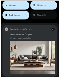 |
| Dark mode disabled | Notification renders with a light background. | 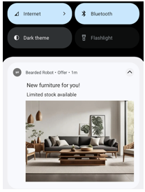 |
Custom Color DefinitionsTemplates support custom color definitions that adapt to both themes for visual consistency.
SDK Version RequirementTo use the Dark mode feature, ensure you are using Push Templates SDK version 2.1.0 and above.
Image Scaling
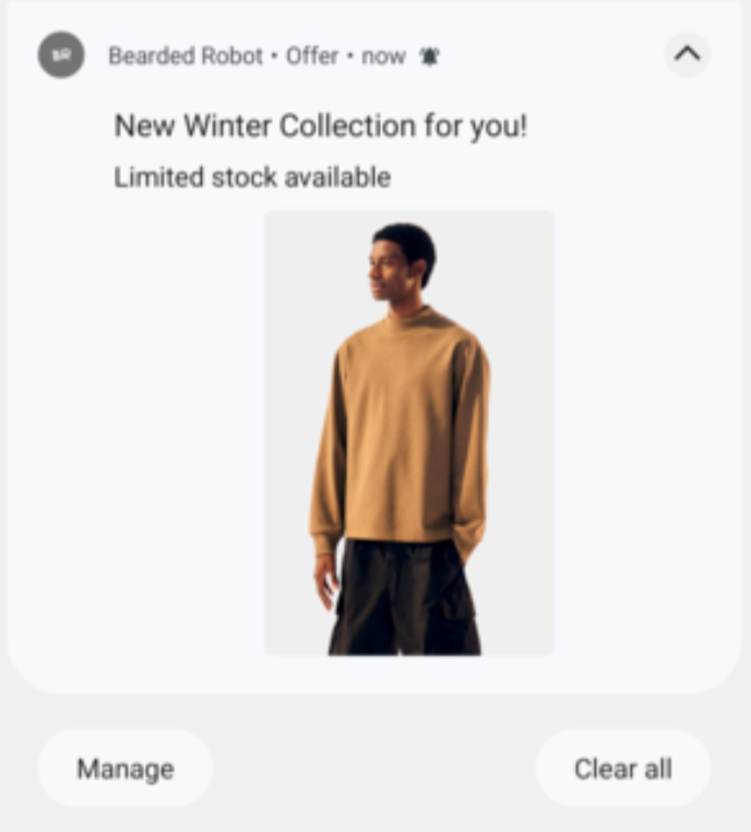
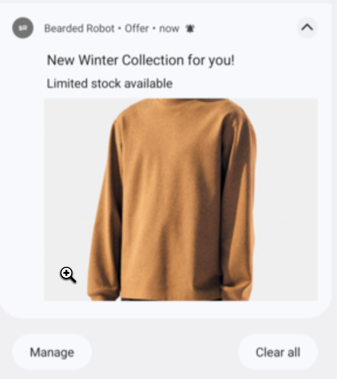
Android supports various image scaling options to control how images appear in push notifications. CleverTap optimizes image rendering to maintain visual consistency across devices while leveraging Android native scaling behavior. To handle scaling in a Push template, you must add the key pt_scale_type key and the value is set as fit_center or center_crop based on the requirement.
The following table lists the different scaling settings in Push templates:
Image Scaling Type | Description | Sample Output |
|---|---|---|
Keep Original | Applies to all expanded images in Android push templates. The image is scaled proportionally (maintaining the aspect ratio) to ensure that both its width and height fit within the boundaries of the image container. This ensures the entire image is visible without any cropping. |
|
Scale to Fill | Applies to all expanded images in all Android push templates. The image is resized uniformly while preserving the aspect ratio. If necessary, it is scaled down so that both width and height fit within the image container. This ensures the full image is displayed without any part being cropped. |
|
SDK Version RequirementTo use the Image scaling feature, ensure you are using Push Templates SDK version 2.1.0 and above.
Image Specifications
The following table shows image specifications, including both standard aspect ratios and CTA-specific variations. Aspect ratios may differ when Call-to-Action buttons are included in the payload.
| Template | OS Version | Aspect Ratio (Without CTA) | Aspect Ratio (With CTA) | Max File Size |
|---|---|---|---|---|
| Standard | Android 11 & below | 5:3 | 2:1 | - |
| Android 12+ | 3:2 | 2:1 | - | |
| Advanced | Android 11 & below | 5:3 | 2:1 | 500 KB |
| Android 12+ | 3:2 | 2:1 | 500 KB | |
| Auto Carousel | Android 11 & below | 5:3 | 2:1 | 86 KB |
| Android 12+ | 3:2 | 2:1 | 86 KB | |
| Manual Carousel | Android 11 & below | 5:3 | 2:1 | 86 KB |
| Android 12+ | 3:2 | 2:1 | 86 KB | |
| Five Icon | Android 11 & below | 1:1 | N/A | 50 KB |
| Android 12+ | 1:1 | N/A | 50 KB | |
| Text over Image | Android 11 & below | 2:1 | 4:3 | 500 KB |
| Android 12+ | 1:1 | 4:3 | 500 KB | |
| Timer | Android 11 & below | 5:3 | 2:1 | 326 KB |
| Android 12+ | 3:2 | 2:1 | 326 KB | |
| Rating | Android 11 & below | 5:3 | N/A | 500 KB |
| Android 12+ | 3:2 | N/A | 500 KB | |
| Product Catalogue (Linear) | Android 11 & below | 2:1 | N/A | 86 KB |
| Android 12+ | 3:2 | N/A | 86 KB | |
| Product Catalogue (Vertical) | Android 11 & below | 1:1 | N/A | 86 KB |
| Android 12+ | 3:4 | N/A | 86 KB | |
| Input Box | Android 11 & below | 5:3 | N/A | 500 KB |
| Android 12+ | 3:2 | N/A | 500 KB | |
| Vertical Image with CTA | Android 11 & below | 2:3 | 2:3 | 500 KB |
| Android 12+ | 2:3 | 2:3 | 500 KB |
Image Guidelines
Ensure images for the following templates meet the specified resolution and file size guidelines:
| Template Name | Recommended Resolution | Additional Guidelines |
|---|---|---|
| Standard Template | - | No specific guidelines; single image template |
| Auto Carousel Template | 400 x 300 px | File size per image: 86 KB max |
| Manual Carousel Template | 240 x 180 px | File size per image: 86 KB max |
| Five Icon Template | 300 x 300 px | Square aspect ratio (1:1); 5 icons total; file size per icon: 50 KB max |
| Product Catalogue Template | 225 x 225 px | File size per product: 86 KB max; Vertical variant uses 3:4 aspect ratio (Android 12+) |
| Standard Template with GIF | 240 x 140 px | 5 frames max; Android 14+ recommended; size limits do not apply to Standard template GIFs |
| Text over Image Template | - | Center-align text within image for Android 12+; no specific guidelines for single image template |
Note
- These are recommended aspect ratios and file size limits.
- Number of lines of text in
msg_summaryaffects how an image renders for a particular aspect ratio. Adjust aspect ratios and layout accordingly based on message length.- Resolution limits do not change based on whether the push has CTA buttons or not.
- Templates other than Auto Carousel, Manual Carousel, and Five Icons do not require specific image resolution guidelines as they use a single image.
FAQs
For FAQs, refer to Push Templates FAQs.
Updated 7 days ago